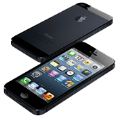
Will your mobile-friendly email designs and templates still accurately display on the new iPhone 5? Are your media queries bound to succeed, or be sunsetted? In this post, we look at the implications of the iPhone’s new display dimensions on email designs and designers, including practical code examples that you can use today to prepare your campaigns.
 In the wake of the Apple iPhone 5 announcementyesterday, at least a few of you are probably wondering how this new device’s larger display is going to affect both email designs and designers alike. While for many who have incorporated responsive techniques into both their templates (and undoubtedly, web sites), these changes won’t have a considerable impact, its likely that others may wake up to find their media queries falling over in some circumstances.
Pretty much everyone who’s dabbled with mobile design has used @media only screen and (max-device-width: 480px) { … } as the starting point for their stylesheets. This has been sufficient when targeting earlier iOS devices (and a variety of other vendor handsets, for that matter), however the iPhone 5’s 1136 x 640 pixel resolution has moved the goalposts somewhat.
When a pixel isn’t a pixel
Like previous Retina and high-resolution displays, the iPhone 5 screen has a device pixel ratio of 2, which bluntly means that every 2 physical pixels on the display equals 1 device-independent pixel (or ‘dip’) to software. If you’re unfamiliar with this concept, QuirksMode explains it really well.
So while the iPhone 5 has a physical pixel resolution of 1136 x 640, the dip/device-width resolution is 568 x 320. Thus, to target iPhone 5’s specifically, the declaration would look like this:
@media only screen and (min-device-width: 320px) and (max-device-width: 568px) { /* iPhone 5 CSS styles */ }The good news is that in the portrait orientation, all iOS devices (with the exception of the iPad) still have a device-width within this range. However, things get interesting in landscape mode, where the 568px width is in excess of the max-device-width: 480px commonly used across web and email CSS stylesheets alike.
Will the iPhone 5 change everything?
If you’ve used max-device-width: 480px as the basis for your mobile stylesheet and view your design on the iPhone 5 in landscape orientation, the email will revert back to how it displays in desktop and webmail email clients (ie. the media query won’t be applied). In most cases, this won’t be such a bad thing – the iPhone 5’s 568px-wide display is not too far off the 600 – 650px widths that most folks use for their email layouts, so a little zooming will be in order. However, for those sensitive about having the mobile version display in any orientation, there are three options:
- Change your media query declaration to @media only screen and (max-device-width: 568px) { … }
- Go for a fluid, fully responsive email layout
- Apply both of the above
Avoid user-scalable = no (please!)
If you’ve used the viewport meta tag with user-scalable = no to tame the zoom in mobile email clients, don’t. Preventing users from freely zooming is a usability issue in itself. After all, mobile display resolutions outside of 480 x 320px have existed well before the iPhone 5 came along, but having zoom disabled is sure to become more of a problem with the iPhone 5’s new display dimensions and inevitable popularity.
What are we going to do about it?
If you’re new to mobile email design, or are unsure about any of the above, I highly recommend you check out our guide on Responsive Email Design. Packed with all sorts of useful tidbits, it will get you confidently coding mobile-friendly emails, subscribe forms and more in 8 simple chapters.
We’ll be keenly testing email campaigns in iOS 6 Mail on the iPhone 5 in the coming weeks and will be sure to update our resources, based on the results. As always, keep an eye on this blog, where we’ll be posting what’s new in mobile email design.
Posted by: Ros Hodgekiss


