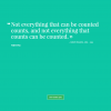
Hello there! It’s time for little inspiration and this time I wanted to showcase something different. You may know that very popular designer slogan – “More is Less”, and yes it’s often so true – unexperienced people tend to overcrowd, use too much colors in their designs. I just love these designs – they are very light, clean and usually uses only monochrome color scheme and just one or two bright colors for links or headers.
You may also notice for such designs it’s more about grid, harmonic distribution through whole page and very silent, elegant accents. It’s not about many colorful photos,images or icons, crazy backgrounds or experimentation. Almost all of those designs are very clean, slightly increasing web page loading time, sometimes it’s crucial to have as light designs as possible, for example reddit, digg, stumbleupon social networks also consist of very few images and where is possible just color and CSS is used.


