When it comes to email, code like it’s 1999. Design like it’s 2012.
I was looking at Spyrestudio’s recent round-up of ‘27 Responsive Website Designs for Mobile Safari‘ and was struck by a strange, familiar feeling. ‘Heck,’ I thought, ‘a lot of these sites look like email newsletters!‘
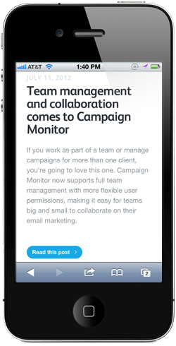
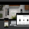
Indeed, many of them did resemble the newsletters we feature in our email design gallery. Not just the modern aesthetic, but also the placement of design elements, the emphasis on branding, the one-column layouts. Even ourrevamped, responsive blog looks like a fine email newsletter (pictured).
Then it occurred to me that there’s a lot of commonality in the processes used to design a mobile version of a website and design an email newsletter. Both present interesting usability challenges, aren’t suitable mediums for conveying lots of text and place large emphasis on visible links and clear calls to action. Both absolutely must cater for short attention spans and fidgety readers. So, perhaps for as long as we have been recommending that designers look to the past when building HTML emails, we should have been prompting them to look towards the now.
In this post, we’ll look at some of the common features that appear in both successful responsive mobile and email designs. If you’re keen on combining responsive techniques and email afterwards, we have a great guide on Mobile Email Design to help get you started.
Prioritize content
The first thing that’s evident when you view a thoughtfully-created responsive site is how much effort has been put into refining a message and making it immediately visible. This is because reading and scrolling takes effort, which affects already-limited attention spans. All of this diminishes the likelihood that any block of text is going to get read from start to finish.
Solo’s site is a great example of this thinking in action – at a glance, you can see what this web app does, how much it costs and even find out about their 1-year promotional offer. With a strong call-to-action, it could easily be reworked into an email design (and a responsive one, to boot!).
Commonly, folks fall into the temptation of treating marketing communications as a dumping ground for content. In reality, unless you’re a Louis CK fan, you’re not going to sit around as an email recipient for the punchline (or ‘Buy Now!’ button) at the end of a long-winded speel. Or in essence, an important part of prioritizing content is prioritizing only some of the content.
Design for ultra-short content (and attention spans)
Last year, we covered some important research that our old friend Jakob Nielsen had done on usability and email newsletters. In his words:
“…the average time allocated to a newsletter after opening it was only 51 seconds. “Reading” is not even the right word, since participants fully read only 19% of newsletters. The predominant user behavior was scanning. Often, users didn’t even scan the entire newsletter: 35% of the time, participants only skimmed a small part of the newsletter or glanced at the content.”Jakob Nielsen, Email Newsletters: Surviving Inbox Congestion
In a similar vein, Web Performance Today found that iPhone and Android users spend less time on sites, view fewer pages and bounce more than regular web users. If you’re designing for folks that aren’t going to dedicate much time or patience to your message, then you’re on the right track to building ultra-short, ultra-usable email newsletters.
Set your own breakpoints
While selecting breakpoints, or popular viewport dimensions is a big (and sometimescontroversial) deal when designing for the mobile web, email designers don’t talk about them much in the context of email. Perhaps this is because the majority of folks use 550-650px as a hard-and-fast static width for email and then simply assume that an email’s width and depth are going to be seen in its entirety. If anything, I’m very much guilty of this.
However, in desktop and webmail email client preview panes, or in mobile clients that don’t support media queries, what’s visible at reduced widths and depths is important. If you have a ‘Download now!’ button on the right-hand side of a design, will it still be easy to find when only 500px of a design is visible? Or if its fallen ‘below the fold‘?
Viewing your email at less-than-ideal dimensions can really help with prioritizing content and creating easy-to read designs. As an aside, those in the mobile web design world who disavow creating static versions of a page around set breakpoints often suggest using fluid layouts instead. If you’re feeling adventurous, you can do the same with email.
One-column, zero problems
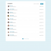
You’ve probably noticed that Spyrestudios’ round-up consists solely of one-column designs. This is because one-column is super easy to read and devoid of visual distraction, making it ideal for mobile devices… And inboxes, for that matter. We’ve seen email newsletters that look great in small viewports, even without media queries, by virtue of them having large text, a reasonable width and perhaps most importantly, only one column of content – this email for Chef Anahita(pictured) is a neat example.

Make your calls to action loud!
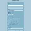
If your newsletters are geared towards generating click-throughs to your site (and presumably, getting folks to do something after that), then it makes loads of sense to add a big, bold call to action, in the same way as you see designs with large buttons / target areas on mobile sites. Here’s a great example from Clean Air Works. Too commonly we see tiny links being used – if you would have trouble tapping it on a mobile screen, then it’s likely it’s going to be ignored amongst your email content, too.
Finally, we’d like to see more designers look at email in new, creative ways. While they may never be as flexible from a code perspective as mobile sites (at least, not in lumbering clients like Outlook), that doesn’t mean there’s no place for modern techniques and methodologies. If you’ve seen our previous tutorial on progressive disclosure, you’ll see there are big advantages to thinking about email from the perspective of a modern designer, instead of caving into the table-based ways of times past.
By: Ros Hodgekiss
Source: http://www.campaignmonitor.com/blog/post/3766/what-email-designers-can-learn-from-the-responsive-web

